Making "Human City" Pt. 1
In this post I want to detail how discovery during the map making process has altered my thinking about what this map was to be and what making maps meant to me. I am still early on, but here I’m tracing the earliest movements of imagining what this thing is to be, and how everything eventually changed.
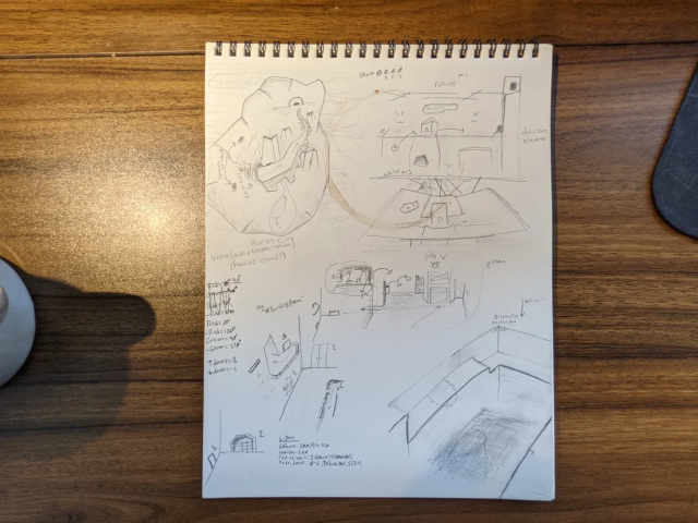
Human City, which this map was always named, began as a drawing of an elevated stone bridge winding between towers to a fortress gate at the end of a valley. That is what the top left drawing shows. I think this drawing was done in very early January, maybe before I completed my first map, Crowded Mouth, while watching dumptruck_ds’ tutorial videos. But I started actually building this map in Trenchbroom (the program I am using to build the map) sometime closer to February.
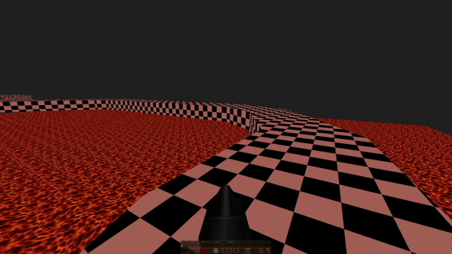
My first move was to construct the winding bridge path, which was done as a “one more thing” task at the end of a busy day. Drawing brushes is easy enough work, especially when you agree not to fuss the details too much and leave the whole thing untextured (indicated by the checkerboard look, that means a texture was not applied to the brush). Then I made a plane of lava underneath it so the bridge wasn’t just floating in the void, and because it made walking along it in first-person much cooler. Then it was off to bed, or whatever.

Whenever I returned next to building Human City, all I had was this bridge, and so I felt compelled to build “from” the bridge instead of doing something else disconnected. I started building the face of the cliff wall which players are meant to discover this path while exiting from an interior cave. Because a cliff face has to look like a cliff face, I had to practice making weird shapes with brushes to make anything less boxy and more natural seeming, which isn’t exactly easy. But I was pleased with the wall I made.
QUICKLY BUILDING; I GUESS PROTOTYPING.
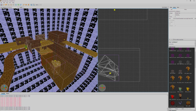
Thereafter I just started building in really fast ways. I wanted to get to building this jumping puzzle room I envisioned, which required players to get from one side of the room to the other without falling down into a body of water. Looking at the drawing at the top of this post, you can see my sketches for this in the top right.
But to get to that room I just started quickly drafting rooms and hallways, creating an experience of movement for players that lead from the winding path I had previously built to this jumping room. I added rooms and turns and descents not just thinking about creating a fun experience moving through the level, but kind of like conjunctive phrases linking subjects together. THE PATHWAY flows from THE JUMPING PUZZLE.
I think somewhat like writing, being familiar with the syntax or speech of a language, the link between things felt sort of obvious, and so it was easy to write/build the connecting phrase or room that was missing. It was maybe like writing a message using only your phone’s autosuggest feature.
Writing a Quake Map, as described by my phone: “It’s a lot more than a lot more than the movies made it to be.”
This is kind of the logic which built all the extra stuff in the picture you see above.
REVISION — FIRST INSTANCE
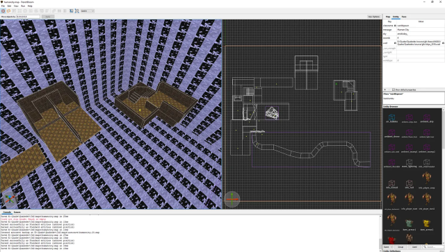
Then I stopped the autosuggestion writing and decided to invent a totally new subject room, which I imagined as something like the DIFFERENT MOVEMENT ROOM.
There was no drawing or sketch for this one, I wrote it using only Trenchbroom.
The idea was to create a lot of variations of movement for a player within one single room, because until that point the experience of movement throughout the map was just linearly moving down hallways or from one end of a room to the next. I had an idea to push players into a water canal running underneath the floor to reach the other side, where enemies were lobbing grenades at them. But after drafting a first attempt at this, I felt like I didn’t really nail it and decided to do something different. In the above picture, the original room is on the left, and the room on the right was a revision of that initial idea of “a room with varied movement” which I wouldn’t have built without previously failing to speak to that idea through the geometry of the original attempt.
It’s exactly like a sentence that you delete and rewrite because it doesn’t carry what you want it to.
And this new room made the overall sentence much better. Below is a picture of that DIFFERENT MOVEMENT ROOM subject phrase. I was able to envision this room more vividly than any previous room I have made. Knowing how it was meant to feel and look like, and what I wanted movement through it to feel like too, I was able to play with detail at a level I never had before. I spent a long time tweaking this space and will probably continue to tweak it some more.
But it is exciting to me because playing it evokes an actual feeling of being somewhere.. a real feeling, approaching some of the stuff I wrote about in my previous post. This was an exhilarating moment for me as a maker.
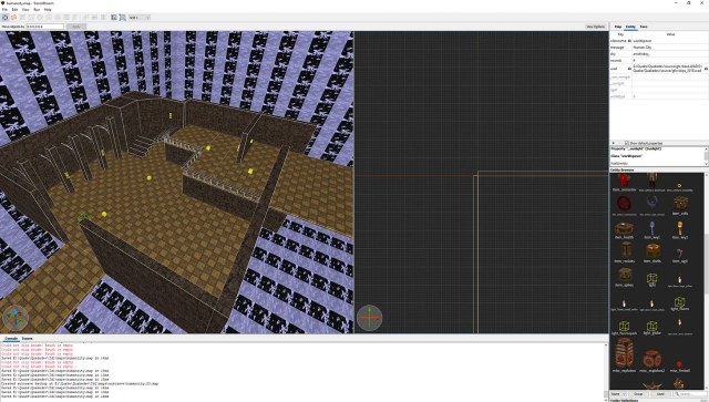
FIRST-PERSON IMAGES FROM THAT ROOM
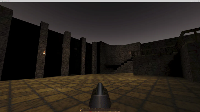
Playing with shadows and height in this room
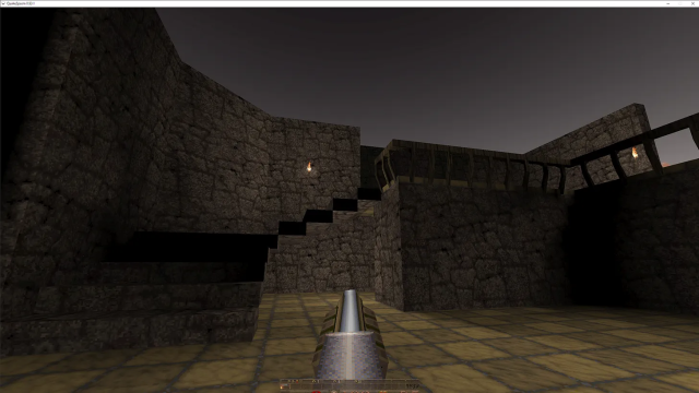
Recognizable architectural features like railings and stairs
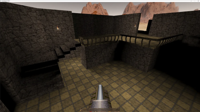
A floating view of the first and second floor
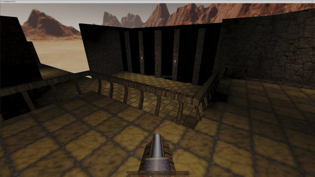
View from the top floor looking down at the first
A GLIMPSE THAT CHANGED THE WHOLE THING
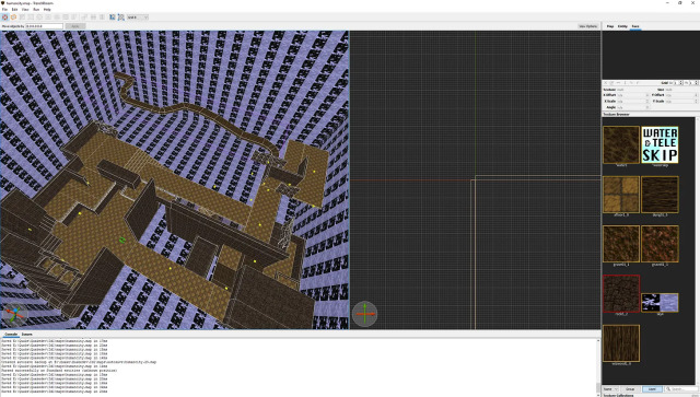
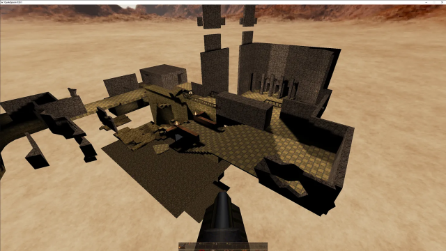
Designing that room has completely changed my vision for Human City. The level of detail I was able to build with pushed me to think of playing with familiar looking architectural features juxtaposed with the strange, geometrical flatness of an amateur map maker. I like the collision there. It is suitably uncanny for a project like this where I am trying to think of virtual spaces as real despite being not-actual, as an encounter with something strange. The application of a skybox to this map (a thing which allows you to apply an image of different skyscapes to the world) made everything feel so alien to me.
Playing with that room, I moved forward with a greater sense of the feeling that the sentence I am building should evoke. The above picture shows an expansion that was born from the discovery of that new subject phrase room. Glimpsing the desert sky and mountains peaking above my unfinished level geometry, I saw there a cohesive aesthetic I am now trying to approach. Below is evocative of that aesthetic. It looks unfinished because it is. But even as I work more on this, I want to hold onto this unfinished look somehow.
Doing that will be tricky, it’s a matter of craft in a medium I can only speak about through metaphors about a different craft I am more familiar with.
